
Exploration
What is the new brand? How are others positioning themselves?
- How can we both play catch up with the modern twist of competitors like sevdesk?
- What is our unique identity?
- What attracts our users?
- Some examples of the old brand
The new brand book was one of the starting points for the exploration. It basically contained the new visual identity, as defined by colors, font, examplury images and the style of the brand book itself. Next to it, I basically went out and explored other software services in the accounting industry, looking at sevdesk, lexware and others as well as more broadly finance services like Qonto, who had a mature brand. My advantage was, that I used BuchhaltungsButler for my company 2zero and therefore, had an easy time to dive into the user perspective.
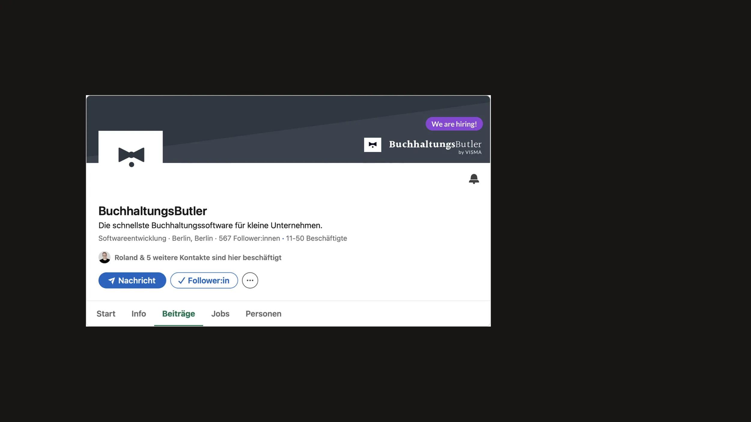
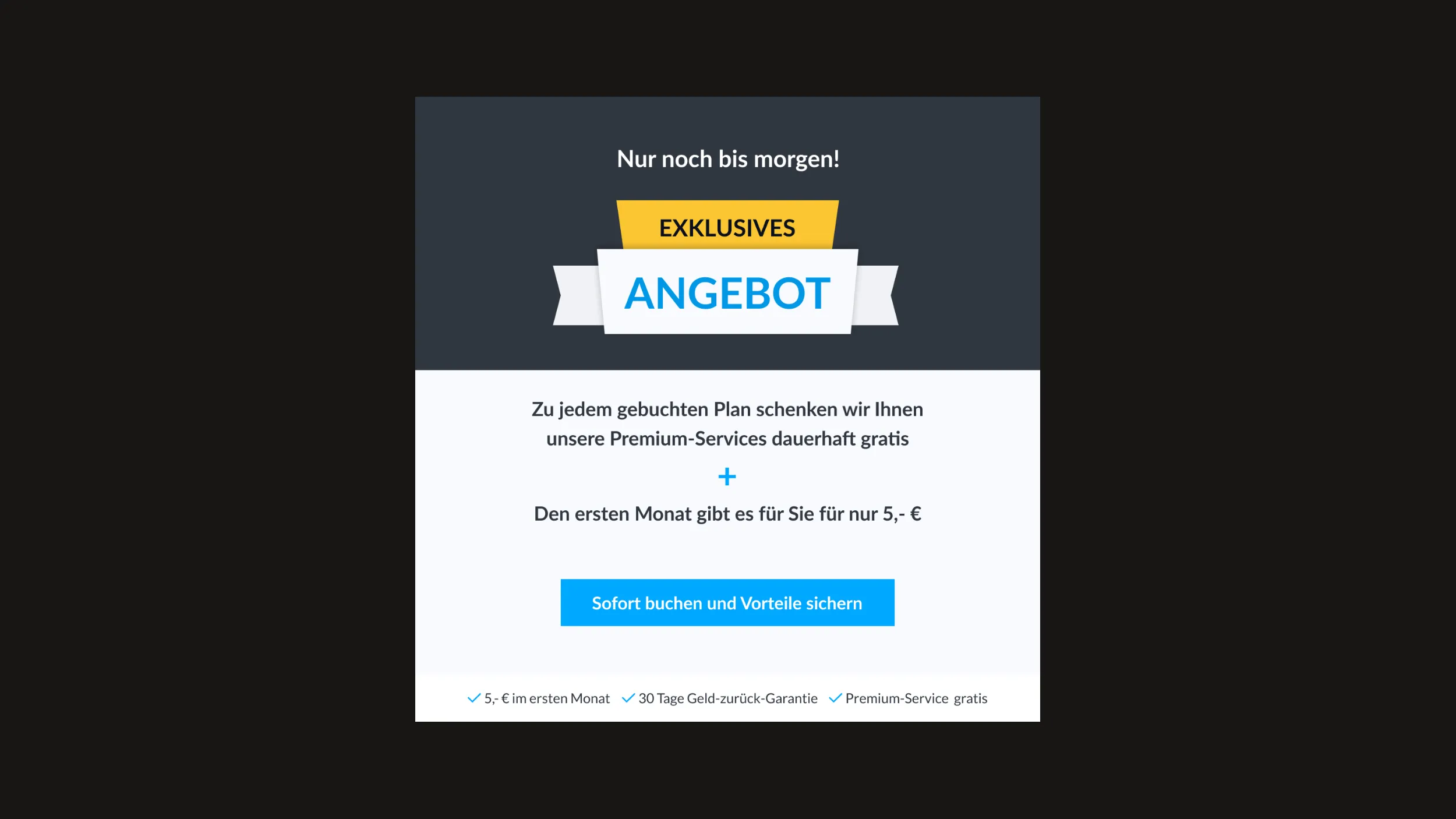
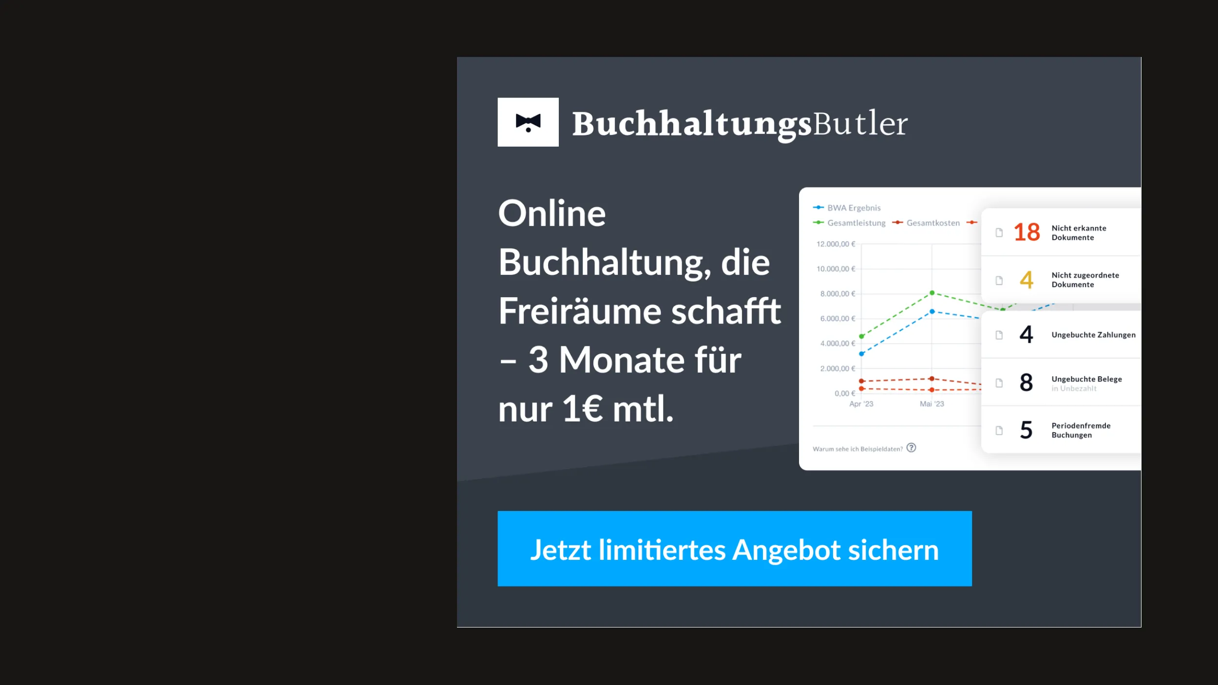

Definition
Which turns did I take?
- Use the primary blue as eye catcher, yet be careful with its -500 saturation.
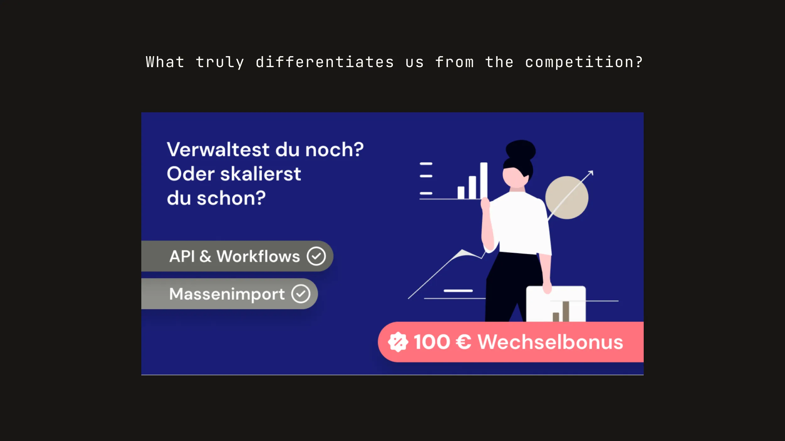
- Use the secondary and tertiary color with purpose, for example the red as indicator for an offer.
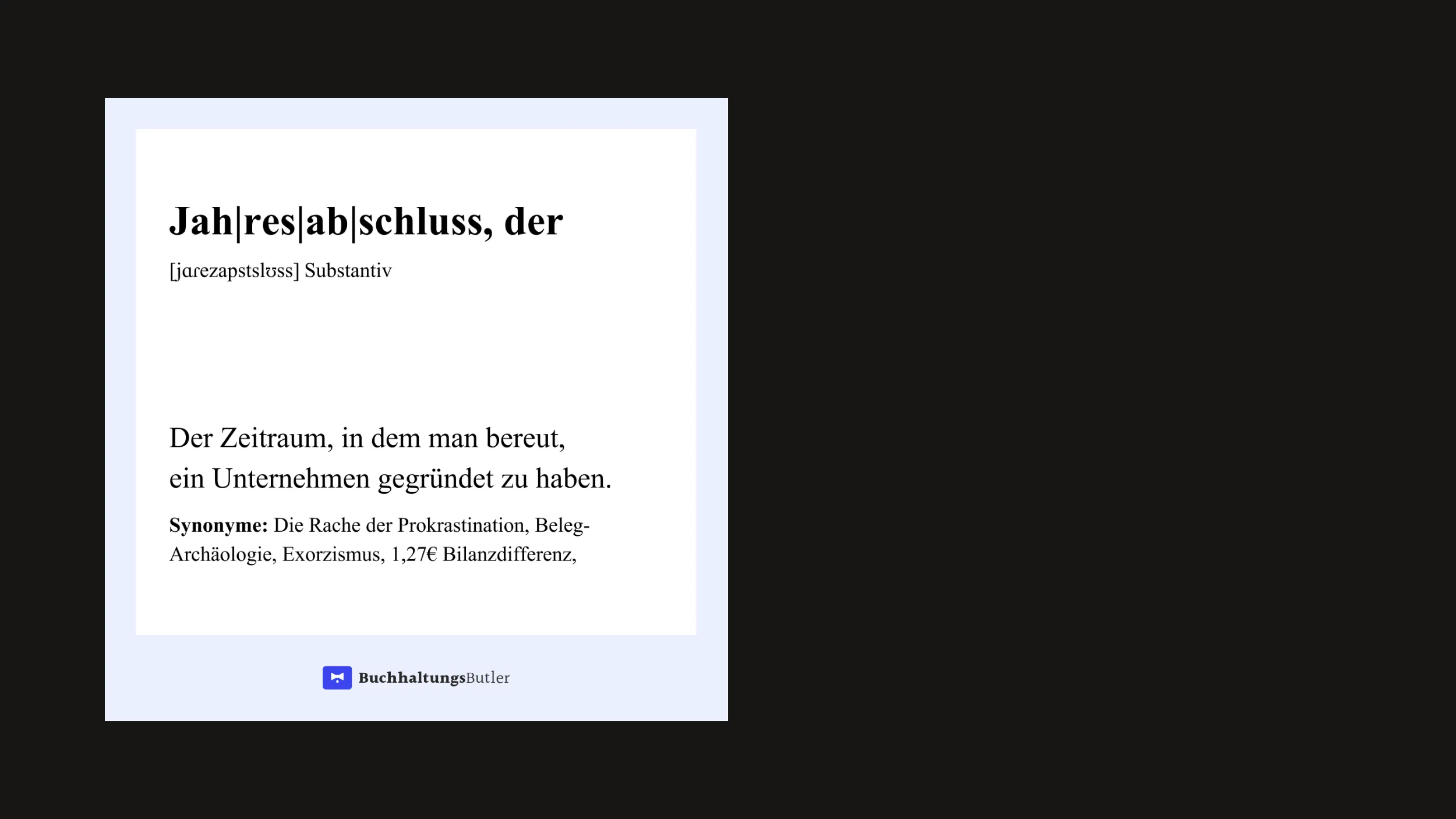
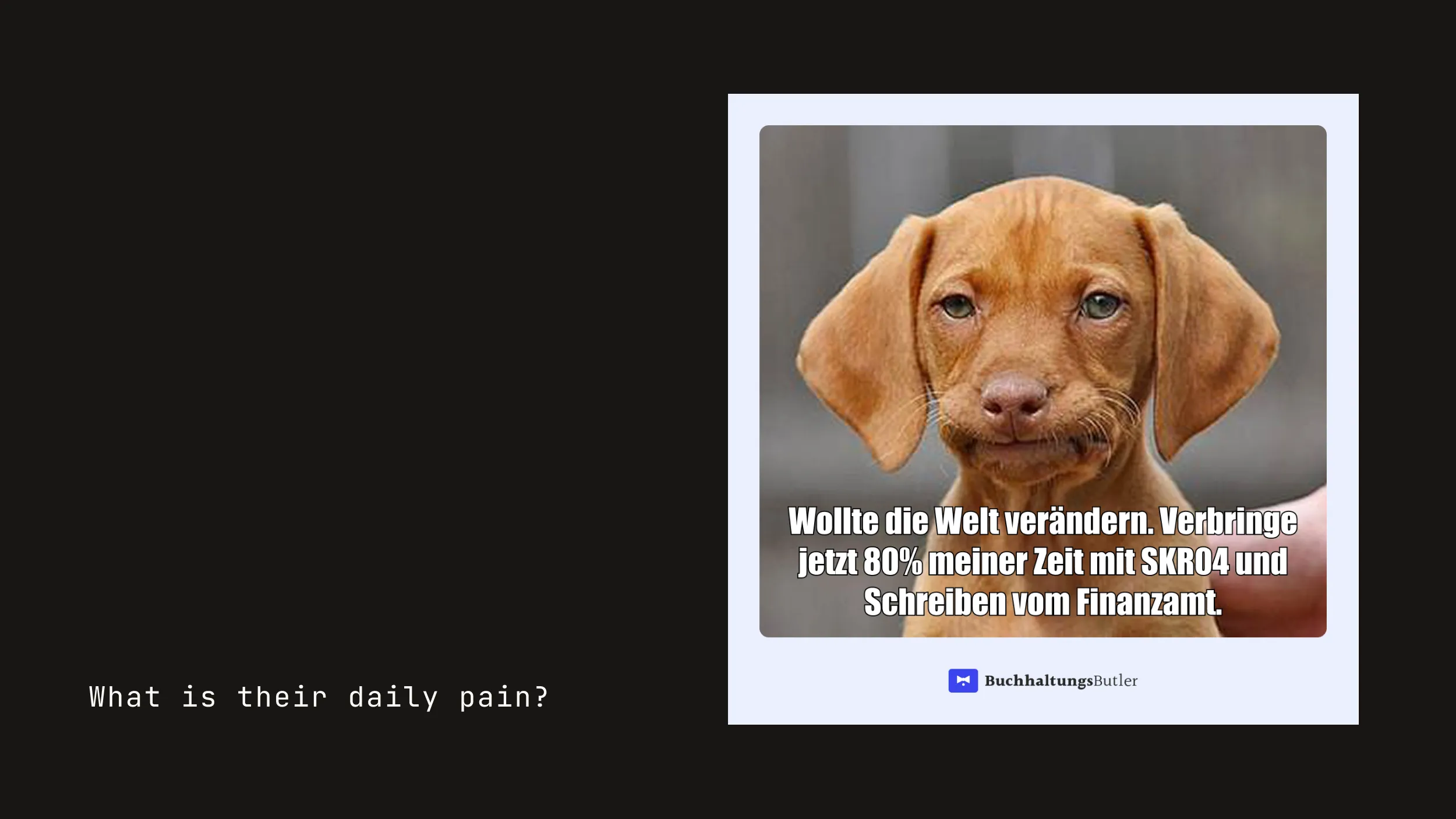
- Embrace the verbal identity of "accounting is annoying but we make it less annoying".
- Use conversion rate results to understand the effects of image vs text vs illustration.
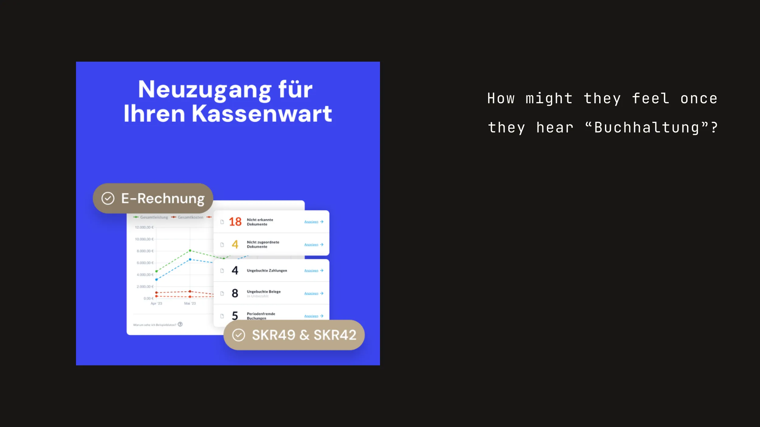
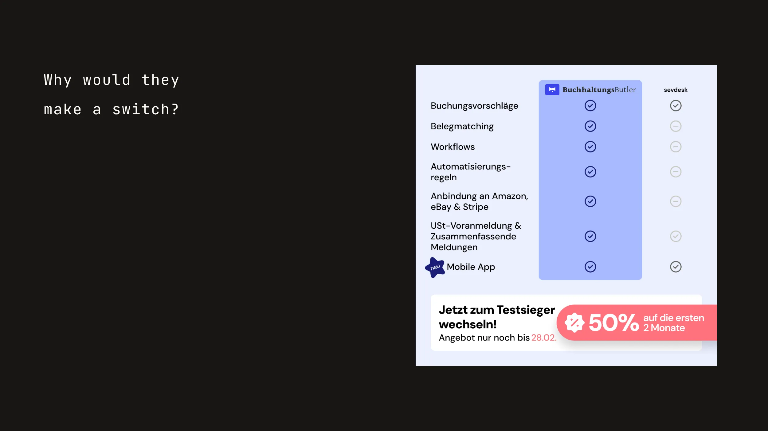
This was my first thorough brand work, so it took some iterations and feedback loops to slowly discover the overall direction for the brand materials. In the beginning I for example heavily overused the primary blue and over time more and more played with less saturated versions and also the secondary and tertiary color. Luckily there was a large backlog of required brand materials to test out the directions in various settings. The most fun part was probably exploring the verbal identity. As I said, I myself had to struggle with accounting in Germany and also the relief of having BuchhaltungsButler as a guide. So I quickly had multiple ideas for how to frame the verbal identity.
Development
What did I end up designing?
- Developed multiple brand materials and assets.
- Tested new assets for performance marketing in regards to conversion rate.
- Supported with the rebranding of the website.
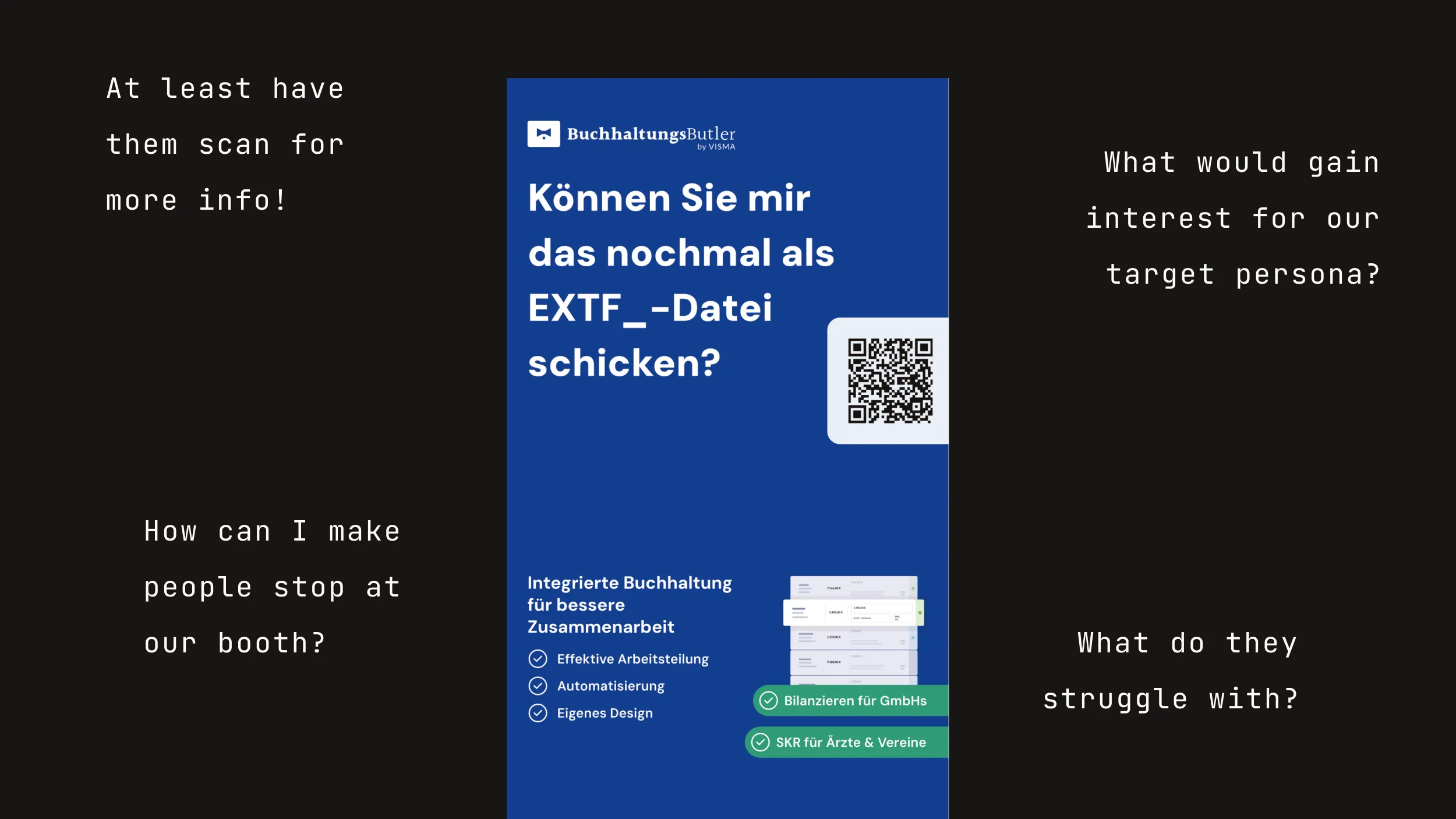
- Stepping out of my comfort zone (Figma) for print designs in Affinity.
Once I had my direction I dove into creating a couple of design systems for the various brand materials, from performance marketing to social media assets to internal presentations. With each set and iteration I also found new approaches to fine-tune the brand. In parallel BuchhaltungsButler updated its website to reflect the new brand, which required additional assets and also guidance from my side.
Feedback
What my colleagues said!
- Offered a permanent position after project.
- Needed first guidance regarding composition and layout.
- Grasped the customer needs and translated them into conversion-improved marketing assets.
This was my first full-time position as a Designer and I wasn’t prepared to actually spent 90% of my time with designing in this internship, as I didn’t expect to provide enough value. But my colleagues trusted me to deliver and liked the direction. Most of the feedback came from our Head of Design, who especially with the first design helped to get a first feeling for composition and layout. All in all I can’t have performed so badly as they afterwards offered me a permanent position as working student to especially tackle any upcoming design work for their performance marketing.
Learning
What did I take away? What will I do differently next time?
This project fueled my belief for the path of Designer. It showed me both the advantage I have with my previous experience as well as the learning path ahead of me. I did the project before the start of my studies, which also prepared me perfectly to jump right into it. I learned a lot along the way and therefore had multiple little iterations of what I already did differently within the project. My biggest takeaway was probably the critical eye when it comes to content hierarchy.